Why Opik India Recommends Responsive Web Design for Every Business
Website Development & Design
Why Responsive Design Isn’t Optional Anymore
Why Responsive Design Isn’t Optional Anymore
In today’s fast-paced digital world, your website is often the very first impression people have of your business. But here’s the thing — not everyone is viewing it on the same screen. From smartphones to laptops to massive 4K monitors, your visitors are browsing from everywhere. That’s where responsive web design becomes critical.
At Opik India, we believe responsive design is not just a bonus — it’s a basic requirement.
Every website we create is fully responsive because your users expect it, and your business depends on it.
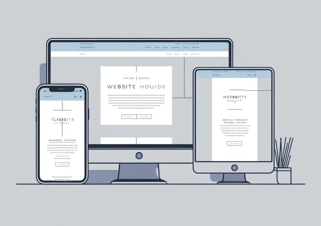
What Exactly Is Responsive Design?
Responsive web design means your website automatically adjusts its layout, content, and images to fit any screen size. Whether someone’s using an iPhone, a tablet, or a desktop, the experience should feel seamless and natural.
When we talk about responsive websites at Opik India, we’re talking about:
Text that’s easy to read without zooming
Navigation menus that are touch-friendly and easy to use
Images that resize without getting distorted or cropped
Layouts that reorganize themselves for different devices
It’s about building trust and professionalism — from the very first click.
The Opik India Approach to Responsive Web Design
We don’t just “make things smaller” for mobile — we redesign the experience from the ground up. Here’s how we approach it:
1. Mobile-First Design Philosophy
We begin with the smallest screen in mind. This ensures that we prioritize only the most important content and features — and then progressively enhance the experience for larger screens.
2. Cross-Device & Cross-Browser Testing
At Opik India, we test every website across a variety of devices and browsers to guarantee consistency. Whether someone visits your site on Chrome, Safari, or Edge — on Android or iOS — the experience remains fluid.
3. Performance Optimization
We optimize everything — from file sizes to image delivery and caching. Why? Because users expect a page to load in under 3 seconds. A responsive site that’s slow is still a problem. At Opik India, speed and responsiveness go hand in hand.
Why Your Business Needs a Responsive Website
Still wondering why this matters? Let’s break it down:
Better SEO Results
Google prioritizes mobile-friendly websites in its search rankings. A responsive site built by Opik India helps improve your visibility online.
Lower Bounce Rates
A clunky mobile site drives users away. But a responsive site keeps them engaged and more likely to explore your offerings.
Increased Conversions
Whether it’s a contact form, newsletter signup, or purchase button — responsive design makes it easier for users to take action.
Future-Proof Design
As new devices emerge (smartwatches, foldable screens, etc.), a well-built responsive site remains compatible. Opik India stays ahead of design trends to make sure your site is ready for what’s next.
Get It Right with Opik India
Many businesses still operate with outdated, non-responsive websites — and it's costing them visibility, trust, and revenue. But you don’t have to be one of them.
At Opik India, we take pride in crafting responsive websites that are as functional as they are beautiful. Whether you’re starting from scratch or upgrading an existing site, we’ll help you build an online experience that connects with your audience — wherever they are.
Let’s make your website responsive, powerful, and future-ready.
Contact Opik India today.

Software Platform Engineering
Software Platform Engineering Enterprise platforms engineered for scalability and...
App Development
App Development Cross-platform and web apps designed for performance....
API & Third Party Integrations
API & Third Party Integrations Seamless integrations for powerful...